


Astryx — Rebuilt in
Figma
Meta's open-source Astryx design system, recreated component-by-component in Figma — built directly from the real React/StyleX source, not visual guesswork.

Complete Theming System
Every theme comes with Light and Dark modes, giving you 14 total combinations. Each component is fully mapped to variable tokens, so switching between modes is a single click — no manual restyling required.
Themes
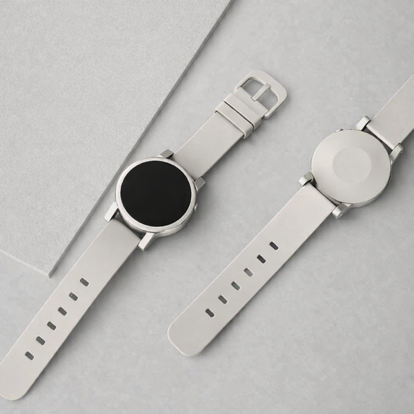
Minimalist Watch
Clean design meets everyday durability.
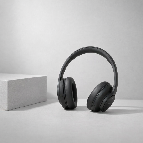
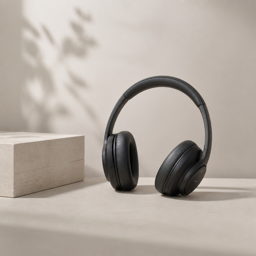
Wireless Headphones
Immersive sound, all-day comfort.
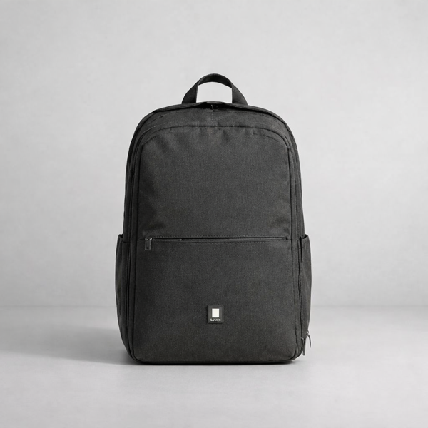
Canvas Backpack
Water-resistant canvas with sleek style.
Inventory
| Item | Available | Location | Tags |
|---|---|---|---|
| Minimalist WatchStainless steel, sapphire crystal | 42 | Aisle 3 | New |
| Wireless HeadphonesANC, 30hr battery | 128 | Aisle 1 | Popular |
| Canvas BackpackWater-resistant, 25L | 63 | Aisle 2 | Limited |
| Leather WalletFull-grain, RFID blocking | 15 | Aisle 4 | Drinkware |
| Travel TumblerVacuum insulated, 16oz | 87 | Aisle 5 | Drinkware |
| Linen ThrowHeavyweight, oat | 24 | Aisle 6 | Home |
Built from real source, not screenshots
Every component in this file was rebuilt by reading Astryx's actual React and StyleX source — not by eyeballing screenshots. That means prop APIs, token bindings, and interaction states that hold up to real scrutiny, duplicated for free so any designer can build with it.
Real prop APIs
Variant and state props mirror the component's actual source signature.
Real token bindings
Color, spacing and radius trace back to the same StyleX tokens the code consumes.
Real interaction states
Hover, focus, active and disabled states match source behavior, not a guess.
Real interaction states
Hover, focus, active and disabled states match source behavior, not a guess.
Real prop APIs
Variant and state props mirror the component's actual source signature.
Real interaction states
Hover, focus, active and disabled states match source behavior, not a guess.
Real token bindings
Color, spacing and radius trace back to the same StyleX tokens the code consumes.
Real interaction states
Hover, focus, active and disabled states match source behavior, not a guess.
115 components, faithfully rebuilt
A sample of the library — hover any tile to see its variant and interaction states.
The primary click-to-act control: submissions, confirmations, navigation.
Single-line text entry for short values like names, emails, search terms.
Shows a user's photo falling back to initials with optional status indicator.
Groups radio items with Field-style label/description/status integration.
An on/off control for settings that apply immediately without form submission.
Collapsible content goes here. This area is visible when the section is expanded.
A single show/hide region with a trigger for progressive disclosure.
Complete message authoring area with input, toolbar, and status display.
Every value is a token
Text
primary
#1D1C11
secondary
#605F52
disabled
#ADAC9E
Background
surface
#FFFFFF
body
#FDFBE4
muted
#F3F2E2
Border
default
#E5E3D4
emphasized
#C7C4B2
Icon
primary
#1D1C11
secondary
#605F52
disabled
#ADAC9E
Accent
default
#225BFF
accent-muted
#225BFF33
on-accent
#FFFFFF
Overlay
default
#1D1C1180
hover
#1D1C110D
pressed
#1D1C111A
Spacing scale
Shape
--radius-none
--radius-inner
--radius-element
--radius-container
--radius-page
--radius-chat
--radius-full
Elevation scale
shadow-very-low
shadow-low
shadow-medium
shadow-high
shadow-very-high
shadow-overlay
Duplicate it, use it, ship it
Free on Figma Community. No account gate, no watermark —
just the file.